
👋Hey Composers (Android developers)😄, finally wait is over and Jetpack Compose 1.0.0 is here 🎉. In this article, we’ll see how to use InlineTextContent to use composable in the text line in Jetpack Compose.
⚡Introduction ️
While developing Android applications, we sometimes may have a design-use-case that we need a design that aligns with the Text component. See below diagram 👇 (Forgive me for my bad design and example 😬)
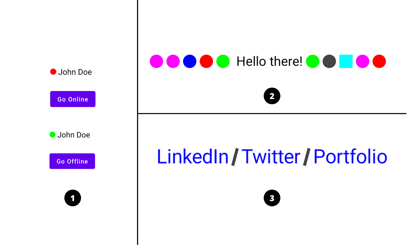
Here’s what I want to explain from this diagram:
- Showing user presence (online/offline) ahead of user’s name
- Showing some shapes with text (just for example)
- Adding a divider/separator between social links.
Let’s see then how to implement UI 3️⃣
💻Implementation
Okay. So we have to design a UI where we want to show three text items i.e. LinkedIn / Twitter / Portfolio and have separator in between these items. We know we can build divider UI using Box with Shape as a clip. So let’s do that.
Basically, we can do these things by using Row, right? So what’s an advantage here? So the advantage is the size of composable always remains with the size of text and we can control it. You’ll see how we provide size to inline composable content in some time 👇.
Jetpack Compose comes with foundation group which provides ready to use building blocks and extend foundation to build your own design system pieces. InlineTextContent is part of foundation group. Let’s directly see code and step-by-step understand what is what and why!
Let’s first create a Composable function with basic setup of showing text.
Basically we use AnnotatedString to set different styles within the same Text composable and for this we use buildAnnotatedString{} lambda function which provides a Builder so that we can append or add styles to text.
appendInlineContent() of a Builder is used to insert composables into the text layout and by using this, we are going to add divider (Composable Shape) in between the text items. Let’s see usage 👇
appendInlineContent() requires id as a first parameter which is referred by BasicText to replace the corresponding composable at runtime (we’ll see this). The second parameter is alternateText is actually appended to the AnnotatedString and marks the range of text to be replaced by inline content and is also used to describe the inline content by accessibility feature.
We can have multiple types of inline composables inside AnnotatedString and every composable is uniquely identified by its specified id. Just like here, we want to show only one type of composable i.e. Divider. So we have just repeated it twice and we have created common id inlineDividerId.
Now let’s proceed 👉
Here we’ve created Map of String i.e. id and InlineTextContent. As discussed earlier, we can have multiple pairs of id and inline content. PlaceHolder is required to InlineTextContent which takes width, height and vertical alignment for inline content. The value specified to width and height defines the size of the composable in the text line and is always proportional to the size of a Text. Now insider the content, we have specified Box layout with Rectangular shape having color and some rotation.
Finally, we have used BasicText and provided AnnotatedString i.e. text which we created earlier and Map of Inline Content.
Yes, that’s all needed! 😃 Now just run the app and see magic ✨.

Refer to this gist for full code snippet and happy Composing 🙌
I hope you liked the article and found it helpful. Thank you! 😃
“Sharing is caring”